Seasonal adjustment, Part II
In the previous post, we discussed some of the methods that can be used to detect and adjust for seasonal/cyclical patterns in our data using sine waves and frequency domain approaches. In this follow-up post, we'll return to the time domain to discuss some basic approaches there, as well as how to put it all together to create a model for our univariate time series. This approach is often referred to as the Box-Jenkins approach, in reference to the approach described by the two British statisticians George Box and Gwilym Jenkins in their analysis of gas furnace data. Although the method is not substantially different from that used for most models (Model selection, parameter estimation, model checking), the features that are particular for time series with respect to model selection are worth reviewing here, as we will be applying them soon in creation of our model.
Steps for model selection
1) Evaluate for trend (stationary): The first step of time series analysis is to evaluate, and modify if needed, the time series variable to ensure that it is stationary. The distinctions between strong and weak stationarity are beyond the scope of this post, but in general if a time series is stationary, its probability distribution (the stochastic process generating the data) is stable over time. Non-stationary data generally indicates an underlying trend in the data, which can be linear or polynomial, and must be removed if the additional time series approaches are to be applied. There are two broad methods for removing stationarity: Differencing and modeling the trend. Differencing is the more straightforward method, which basically involves subtracting the prior value of a variable (t-1) or subtracting additional prior values (t-n). In general, differencing once removes a linear trend, differencing twice removes a quadratic, etc. The downside of differencing is that information about the trend (slope, etc.) is lost in the process, and therefore for most exploratory/scientific approaches, the best approach is modeling the trend, in which case we would include time (± time^2, etc.) as a covariable in a linear model, and then examine the residuals. These two approaches do not give the same results, and often one has to play around with different approaches to find the one that works best, as trends are never perfectly linear, quadratic, etc.
2) Evaluate for seasonality: As we discussed in a prior post in detail, seasonal/cyclical patterns in data can be a confounder if we do not appropriately adjust for them. In Part I, we discussed how to use frequency domain approaches, specifically the periodogram, to examine for potential seasonal effects in our data. We also included one approach to model these effects, using sine and cosine functions in our regression that included the frequency (1/Period) of the effect. In the part (below), we'll discuss other approaches in time domain to examine for and model these effects, from simply including a single indicator term for seasonality to seasonal differencing and development of seasonal ARIMA models.
3) Identify autoregressive and moving average terms (ARMA model): Once data has been made stationary, and seasonality has been removed, we can focus on identification of any autoregressive or moving average terms that should be included. Here, an autoregressive (AR) term refers to a prior value of the time series that can effect the present value. For example, in an AR1 model, yt ~ Φ yt - 1, where Φ generally must be less than 1 and greater than -1. A moving average (MA) term refers to a prior value of white noise. Here, yt ~ σt + θσt - 1, where 1 ≥ θ ≥ -1. There are various methods to identify and fit these terms. Visually, one can examine the autocorrelation function (ACF) and partial autocorrelation function (PACF), which can help identify the order of AR and MA terms, respectively. Or, for a method that might scale (as we are seeking here), we can fit multiple models up to a certain feasible order, and identify the correct one based on some measure of fit (many recommend the corrected Akaike Information Criterion, AICc, for time series). The auto.arima R function ('forecast' package) we used in prior posts uses the latter approach, although undoubtedly there are statisticians around the world who would highly object to use of such an automation...
Time Domain Approaches to Identification of Seasonality
Let's start by using the bread-and-butter analytical tools of time series analysis, the autocorrelation function (ACF) and the partial autocorrelation function (PACF). These two related measures examine the correlation of a given measure with itself at various lagged time points, with (PACF) or without (ACF) adjusting for prior lags. There are different well-recognized patterns to the ACF and PACF for differing autoregressive (AR) and moving average (MA) relationships, although a basic rule of thumb is that a high value in one or the other at a given lag indicates a correlation for that lag, with ACF indicating an MA effect and PACF indicating an AR effect. For example, a model with a sharp peak at lag 1 of the PACF would generally be best modeled with an AR1 model.
Seasonal effects can also be detected using ACF/PACF plots, in which case the period would generally be noted with a regular pattern of peaks at the cycle frequency. For example, a weekly pattern in our Fitbit steps data would be seen as peaks every 7 lagged days; biweekly at every 14 days. In Figure 1, we see the ACF/PACF plots for this data, in which there is a strong peak at lag 14, and peaks at lags of periods of 7 or 14 over the last 100 days.
Figure 1. ACF (top) and PACF (bottom) plots of Fitbit step data for 100 lags. Peaks are seen in both plots are roughly every 7 to 14 days. See text for details.
Use of ACF/PACF plots is one of several methods we've reviewed for identification of seasonal patterns in data, and represents an important tool for diagnostics of all time series analyses. In prior posts, we also showed how basic ANOVA over a seasonal period, inclusion of sine/cosine functions in linear regression, and full frequency domain approaches (i.e., periodogram), can be used to detect cyclical/seasonal patterns in our data. Many of these methods offer the opportunity to examine the data for seasonality prior to making any sort of model adjustment. From the standpoint of an statistician, this is appealing and in theory would limit the number of steps taken in modeling a dataset (by being able to identify ahead of time the appropriate model for the data). However, unfortunately for the statisticians, it is sometimes easiest to simply run many possible/feasible models first and then select the best model based on some set of fitting criteria. With the development of greater computing power, this latter method is being used more often as it allows scalability by automating the model selection process. In a sense, the iterative approach therefore forms an additional method for identification of seasonality, by running all possible seasonal patterns and then selecting based on which one fits the data best. Of course, in order to perform this analysis, we need to review how to fit seasonal ARIMA models.
Time Domain Approaches to Adjust for Seasonality
If we follow the Box-Jenkins approach to fitting seasonal ARIMA models, we would complete the following steps on our data:
1) Check for trends and adjust if appropriate. A quick look at our data should reveal no clear linear or quadratic trends, but we can go ahead and run a quick regression to prove it. If there is a trend, we can adjust by either removing the fitted values (examining the residuals) or differencing our data. In our case, the linear model is as follows: Steps ~ Time, F statistic 0.67, p value 0.415; indicating no evidence of a linear trend (as expected).
2) Identify seasonal effects. We can use any of the methods mentioned previously, including the ACF/PACF, periodogram (frequency domain), or various supervised approaches (ANOVA, iteration over terms in regression models) based on practical periods in the data. As will be evident below, each of these methods identifies a separate seasonal period as the 'best', and it will be up to us to decide what to do about it.
3) Examine for autocorrelation, and fit appropriate model (ARMA). As we will see below, some methods of automation (auto.arima) include this assessment as part of the overall iterative process, while others we need to examine after we've fit a model with trend and seasonality included.
So, now that we don't have to worry about trends, let's examine some of the automated approaches to selecting the best model. Let's start with a model without seasonality. To assess this, we'll use the auto.arima::forecast function in R. The command, also provided in the full script on our Github page, includes the use of the 'trace' option, so that we can see what models it examines before identifying the best. We'll also use the built-in 'stepwise' option, which avoids the time-consuming process of fitting every possible model before settling on the best (Of note, this option is turned on by default, and if you're not certain that the model you've identified is the best, it's worth turning it off to see the estimates for other models. In our experience, it's pretty good at finding the best). There's an option to select the maximum autocorrelation (q), differencing (d), and moving average terms (p), which we selected 3 for p and q, and 2 for d (although we could have used 0 since we did not suspect any trend in the data (see above). Finally, we need to identify the criteria we want to use for selecting models. Based on others' work, it seems that AICc is the best for selecting time series models. The command is therefore as follows:
auto.arima(Steps, ic = "aicc", trace = TRUE, stepwise = TRUE)
When this is run, we get the following in R:
ARIMA(2,0,2) with non-zero mean : 4082.607
ARIMA(0,0,0) with non-zero mean : 4082.26
ARIMA(1,0,0) with non-zero mean : 4084.806
ARIMA(0,0,1) with non-zero mean : 4083.897
ARIMA(0,0,0) with zero mean : 4594.347
ARIMA(1,0,1) with non-zero mean : 4085.507
Best model: ARIMA(0,0,0) with non-zero mean
When we examine the summary, we get the following:
Series: Steps
ARIMA(0,0,0) with non-zero mean
Coefficients:
intercept
12302.9147
s.e. 262.2014
sigma^2 estimated as 14506174: log likelihood=-2039.1
AIC=4082.2 AICc=4082.26 BIC=4088.9
One of the nice things about using a package like 'forecast' is that it's only one extra step to graph the model forecast. In this case, the model is basically graphing the expected number of steps per day for the next 30 days. As we can see from this graph (Figure 2), the expected value is a straight line (the fan chart shows various confidence intervals out to 99%), which is because the only term in our model is the intercept. Not very interesting. Let's see what happens when we examine seasonality.
Figure 2. Forecast plot from ARIMA(0,0,0) for steps for the next 30 days, with a fan chart confidence interval plot out to maximum 99%. See text for details.
We want to include some seasonal terms, but unfortunately, auto.arima will only help us select the best seasonal ARIMA model if we already know the period. In our case, as we saw in prior posts, there are several possibilities for this, and we want to be able to examine and compare all of them. To help us in the process, we'll construct a for loop in R that will loop through all the possible seasonal periods we want, and select the best one based on some criteria. We'll discuss more unsupervised approaches below, but let's start by just cycling through every possible seasonal period from 1 to 30, and select the one with the lowest AICc based on auto.arima. See the R code for details.
After running the loop, we get the following results:
The best seasonal period is 14 days, which as we saw previously, seemed to be supported by other methods, and provided an AICc of 4063.86, which we note is also lower than the model above (4082.26) and supports the inclusion of a seasonal term in our model.
Series: ts(Steps, freq = i)
ARIMA(0,0,0)(1,0,0)[14] with non-zero mean
Coefficients:
sar1 intercept
0.3195 12352.6969
s.e. 0.0683 355.1901
sigma^2 estimated as 13071857: log likelihood=-2028.87
AIC=4063.74 AICc=4063.86 BIC=4073.8
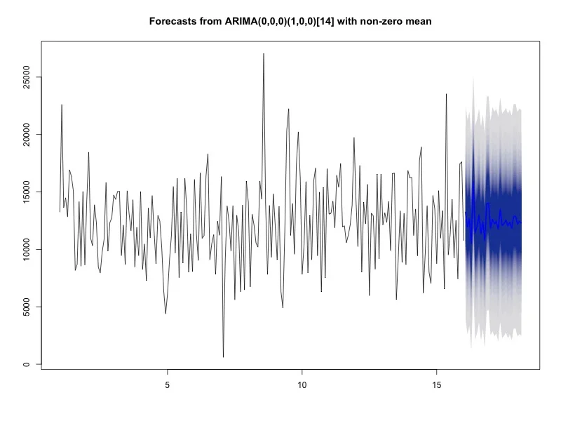
The graph of this model is in Figure 3, which as we can see allows more than just the straight line for forecast steps over the next 30 days.
Figure 3. The best seasonal ARIMA model with 30 day forecast based on seasonal loop. See text for details.
This result looks great, and we could certainly stop here since other approaches have also indicated a period of 14 days, which also makes sense with our substance knowledge of my 2 week schedule. However, as discussed previously, we also want to examine the data using less supervised approaches to insure that we're not missing a cycle that may not necessarily make sense in the practical world, but is more 'important' statistically. To do this, we'll return to the previous post's theme and examine the periodogram for strong frequencies. In this case, we'll set up our algorithm to return the frequencies for the top 5 spectral peaks, and then run these through our auto.arima function, similar to previously. As we'll notice, there's a bug with this approach in that periods in the time domain using auto.arima must be integers. There are time series analysis approaches called fractional differencing approaches, which can accommodate non-integers, although we won't examine those here.
As we saw previously, the periodogram (Figure 4A) reveals top periods at 15.4, 5.8, 3.5, and 2.3 days. When we run these through our seasonal auto.arima loop, we get the following:
ARIMA(1,0,0)(1,0,0)[15] with non-zero mean
Coefficients:
ar1 sar1 intercept
-0.0050 -0.1526 12288.5956
s.e. 0.0702 0.0653 225.9551
sigma^2 estimated as 14171594: log likelihood=-2036.81
AIC=4081.63 AICc=4081.82 BIC=4095.04
Figure 4A (left). Periodogram of Steps with top 5 frequency peaks.
Figure 4B (right). Forecast plot of the 'best' model identified from analysis of the spectral peaks.
See text for details.
Figure 4B also shows the forecast plot (similar to Figure 3) based on this model. As we can see from the AICc (and should have inferred since a period of 15 was included in the early loop), this model is inferior to that of a seasonal period of 14. Perhaps it's reassuring that this period is close. One wonders if appropriate filtering of the periodogram might have identified a peak closer to a frequency of 1/14 (= 0.071), which would have supported our prior analysis. Either way, it raises the question of whether using more 'sophisticated' methods to identify the best period besides iteration are really such a good idea. Of course, use of traditional seasonal ARIMA models doesn't allow us to examine non-integer periods, so perhaps if we use a method that will allow such data, we might see a better result.
When we run the same five top frequencies from our periodogram through a different loop that includes them each in a linear regression model as part of sine and cosine functions, we get a very different result. In this case, the 'best' model includes the period of 2.3 days (which incidentally was also the largest peak on the periodogram-- See figure 4A). These results are below:
lm(formula = Steps ~ time + sin((2 * pi * time)/(1/i)) + cos((2 * pi * time)/(1/i)))
Residuals:
Min 1Q Median 3Q Max
-10421.8 -2532.1 90.8 2484.7 15873.0
Coefficients:
Estimate Std. Error t value Pr(>|t|)
(Intercept) 11943.722 514.751 23.203 < 2e-16 ***
time 3.408 4.211 0.809 0.419283
sin((2 * pi * time)/(1/i)) -134.146 362.820 -0.370 0.711961
cos((2 * pi * time)/(1/i)) 1292.178 362.595 3.564 0.000454 ***
---
Signif. codes: 0 ‘***’ 0.001 ‘**’ 0.01 ‘*’ 0.05 ‘.’ 0.1 ‘ ’ 1
Residual standard error: 3725 on 207 degrees of freedom
Multiple R-squared: 0.06152, Adjusted R-squared: 0.04791
F-statistic: 4.523 on 3 and 207 DF, p-value: 0.004276
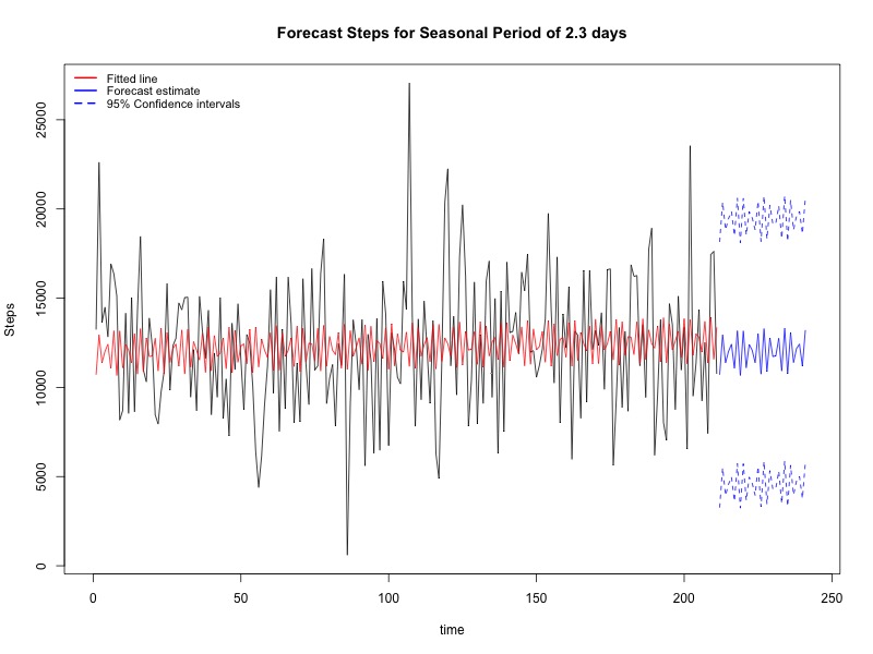
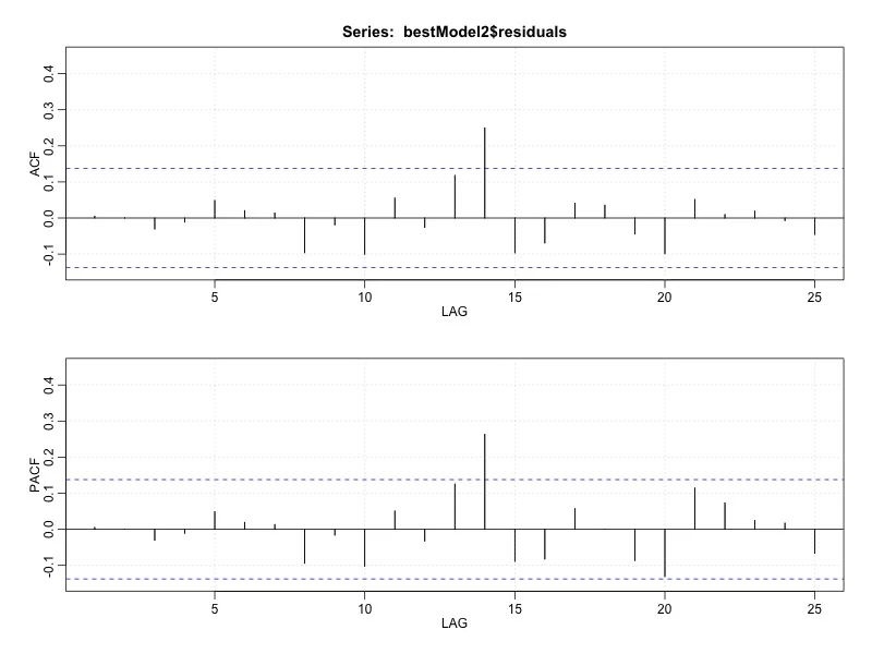
The forecast plot of this model is shown in Figure 5A. A couple of points on this model. First, we went ahead and kept in the nonsignificant trend term, just to keep things straight. This could in theory penalize us using the AICc criteria, although as we'll see it didn't so much, and it did allow us to keep the code for future uses. Second, as you could see from the code directly, this loop uses p value for model selection as AICc is not directly calculated in R. However, we can use an ANOVA table from the linear results to obtain an AIC (= n ln MSE + 2k), as well as AICc (= AIC + [2k(k+1)]/(n-k-1)), which for this model are 3476.05 and 3476.17, both of which are far more better than the ARIMA models above. Finally, this model does not account for possible intra-individual correlation, which (although the auto.arima function above did not select any models with p or q variables) could impact the fit. We can examine this through ACF of the residuals (Figure 5B), which show a pretty significant peak at 14 days, although nothing under 7 days. There are a number of ways to interpret and manage this finding; none, however, would see to be easily automated as again the interpretation is based on human interpretation of the ACF plots.
Figure 5A (left). Forecast plot for steps based on a period of 2.3 days, with 95% confidence intervals.
Figure 5B (right). ACF/PACF plots for residuals from model with period 2.3 days. A peak is evident in both models at 14 days. See text for details.
Just for fun, let's see what happens in our model if we create a manual lag term at t -14 days (2 weeks). The results from the output are below:
lm(formula = Steps ~ time + LagSteps + sin((2 * pi * time)/bestSeason2Period) + cos((2 * pi * time)/bestSeason2Period), data = data)
Residuals:
Min 1Q Median 3Q Max
-9443.0 -2646.3 142.4 2300.7 15776.1
Coefficients:
Estimate Std. Error t value Pr(>|t|)
(Intercept) 8773.1886 956.0661 9.176 < 2e-16 ***
time 1.0478 4.5080 0.232 0.816444
LagSteps (T-14) 0.2774 0.0701 3.958 0.000106 ***
sin((2 * pi * time)/bestSeason2Period) 21.3535 362.7965 0.059 0.953126
cos((2 * pi * time)/bestSeason2Period) 780.9611 371.2097 2.104 0.036696 *
---
Signif. codes: 0 ‘***’ 0.001 ‘**’ 0.01 ‘*’ 0.05 ‘.’ 0.1 ‘ ’ 1
Residual standard error: 3576 on 192 degrees of freedom
Multiple R-squared: 0.119, Adjusted R-squared: 0.1006
F-statistic: 6.482 on 4 and 192 DF, p-value: 6.501e-05
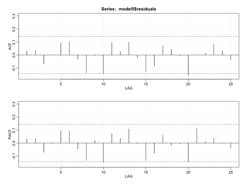
Wow. Definitely a better model. In this case, through addition of a single autoregression term, we've improved the model, with AIC is 3231.7 and the AICc is 3231.9. We've combined frequency and spectral analysis to identify a model that adjusts for the dominant period of 2.3 days of unclear etiology (possibly a 2 day cycle with weekends), and identifies a clear relationship between the number of steps taken 2 weeks prior. In Figure 6A below, we see that the ACF plots no longer demonstrate any significant peaks, and the fit is very nice compared with above (Figure 6B).
Figure 6A. Autocorrelation plots for residuals of the model.
Figure 6B. Steps and fitted plot of the best model with sine/cosine functions for period = 2.3 days, and lagged 14 day regression term. See text for details.
So where does this leave us? In one sense, we've done our part to combine two approaches in the time and frequency domain to fit a model that does a very nice job of describing the number of steps I took per day over about 6 months. On the other hand, despite our attempts at automation, we still found that our models fit different periods depending on the approach, and the best model still required some manual interpretation of the ACF to identify the 14 day relationship. As you can probably imagine, there are a number of directions we could have gone with this analysis using these very approaches, not to mention others. Further, we've only spent our time on a single Fitbit dataset; who knows if someone else will have an entirely different pattern and approach needed. In the future, we'll hopefully get some more Fitbit (and other) datasets to test these hypotheses. One interesting approach for model comparison would be to continue to collect data and examine these forecast plots to see which indeed is the closest to matching the data in real-time. We will plan to explore this approach in testing not only seasonal models, but many others, down the road.


