Seasonal adjustment, Part 1
In the previous post, we reviewed the importance of evaluating and adjusting for seasonal/cyclical patterns in our data, and the consequences in terms of confounding and bias, with not adjusting. We reviewed briefly a couple of methods for examining data for seasonal patterns, both supervised and unsupervised. In the following two posts, we'll dive deeper into some of the methods that can be used both to examine and adjust for seasonal (i.e., cyclical) patterns in our data. The themes we discussed in previous posts will be critical to these analyses, and bear repeating here.
Themes
1) Supervised or unsupervised: Do we care about whether the cycles or patterns we identify reflect something relative to our lives, or do we just want to make sure we have removed confounding? In the case of the former, we should plan to only use cycles/periods that make sense (i.e., daily, weekly, monthly, etc.). In the case of the latter, we would perform some sort of exploratory analysis (periodogram, etc.) before jumping to making an adjustment. (Note, this is a loose use of the term supervised, and is different that what might be found in for example the machine learning literature).
2) Domain of interest: In the previous post, we touched on the broad categories of analysis in the time vs. the frequency domains. However, since there is a fair amount of overlap between these groups, it might be more useful to think in terms of what is our overall domain of interest? In other words, what question are we seeking to answer in our seasonal analysis? If we're interested specifically in identifying and analyzing the seasonal patterns in our data, then the analytical tools we would use are different from those we would use if we only wanted to adjust for seasonal confounding. If our interest is in identification of predictive covariates on an outcome, then we need only make sure that seasonality is appropriately accounted for.
3) Automation vs. manual analysis: This theme has not been well-explored in posts to date, but we'll introduce it here since it will play an important role in determining the types of analyses we can conduct moving forward. For example, manual interpretation of the ACF and PACF plays a key part in determination of the type and order of ARIMA model that should be used, but this type of interpretation is not feasible if we're looking to analyze tens to hundreds of different time series in hundreds to thousands of people. In other words, our approach will need to be scalable in addition to valid on a single dataset.
Goals of Analysis
Before we step into the weeds of frequency-domain approaches, we should also touch on another important theme in time series analysis (well, any analysis really...), which is the goal of the analysis. While we can probably define the goals in multiple ways, depending on the methods being used, for time series analysis we often define the goals in terms of whether we wish to fit greater, fewer, or the same number of data points as the observed data. Based on this characteristic, we generally define our analyses along the following lines:
1) SMOOTHING (Fitted values <= observed values): Data smoothing, as the name implies, involves taking all of the coarse, noisy, observations from the dataset and presenting only the 'relevant' points. Smoothing generally involves use of a filter, which is often either a linear filter (for example following a regression) or a moving average filter, such as a kernel function (i.e., Daniell--see below). For certain cases, such as a linear filter, statistical inference is part of the process; however, more often than not, smoothing is done to improve data visualization, or as a preliminary step before statistical analysis.
2) DECODING (Fitted values = observed values): Decoding is essentially the process of defining the underlying structure of the data, and assessing for latent patterns or states, correlations, and associations with other datasets and variables. The result of decoding is most often focused on statistical inference (e.g., are these two variables associated at significance level of 0.05), although results of the analysis are often used for either smoothing or forecasting.
3) FORECASTING (Fitted values > observed values): Forecasting, or predicting the values of future observations, is a cornerstone of time series analysis, and there is a great deal of literature and methodology around the various approaches. Nearly every analytical approach has a process for forecasting, and we will certainly delve into plenty of these. It is worth mentioning as well that forecasting also provides a method for model assessment in a dynamic process, whereby we can forecast a horizon of future values and probabilities, and then collect more data to see where it fits within the this horizon.
Frequency-domain approaches
The rest of this post will be based around incorporation of frequency domain approaches, with the goal of identification of cycles and patterns in our data. For many analysts (myself included) with training in biomedical statistics, the use of cyclical covariates (sines/cosines) and frequency domain approaches is not something we use, well, frequently (no pun intended). Therefore, to explore the topic we'll start with the simple addition of sine and cosine functions to a basic regression model, and then slowly build up to full frequency domain approaches. Although it's doubtful that much of this will go beyond what one could learn in a basic engineering class, hopefully these techniques will provide some useful tools for analysis of data with cyclical patterns.
The dataset we'll be analyzing will be from my Fitbit, and the R code is available on our Github page.
Some Basics
We're not looking to get our engineering degrees here or anything, but to understand the role of the frequency domain in time series analysis, we need to at least briefly review some trigonometry principles. Data following a cyclical pattern can be described using sine or cosine functions, and is often described as a sine wave. Based on trigonometric principles, these functions describe the regular oscillation of a line between two extremes (A and -A) over time. The formula for a sine wave is given by the following equation:
Y(t) = A * sin(2π*freq + φ) = A * sin(2πt/ω + φ)
where A = amplitude, t = time, and ω = period, and φ = phase. In many cases, since the cosine function is exactly π/2 (or 90 degrees) out of phase with the sine function, we can estimate the phase using the opposite function (Note that the sine curve equals 0 at time 0, while the cosine curve equals A or -A).
Y(t) = A * sin(2πt/ω) + B * cos(2πt/ω)
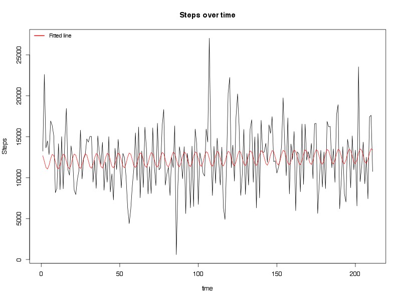
where B is the amplitude of the cosine wave. This function sets up nicely for a linear regression model, in which A and B correspond to the coefficients being estimated. We can see this application in examining the steps data from my Fitbit below (Figure 1).
Figure 1. Linear regression fitted line (red) and daily steps from Fitbit. See text for details.
Here's the regression results from the model:
Estimate Std. Error t value Pr(>|t|)
(Intercept) 11941.391 522.812 22.841 <2e-16 ***
time 3.377 4.277 0.790 0.4306
sin((2 * pi * time)/7) 241.032 368.145 0.655 0.5134
cos((2 * pi * time)/7) 885.486 368.556 2.403 0.0172 *
As we can see, only one of the trigonometric functions (cosine) was significant at p < 0.05, in which over the course of a week, the total steps I took in a day could vary by 885.5. There was little in way of phase changes (sine function not significant, at least not at a weekly period), and there was not a significant trend in the number of steps I took over time. Of course, this approach assumes independence (i.e., no correlation between daily steps over time), which as we saw in prior posts is not necessarily valid for this model, although as we add more frequencies to the model, we are able to model some of the correlation between observations. Regardless, the concept is clear, and indeed the data does seem to (roughly) correspond to the fitted values, albeit not well (R-square value of 0.018, p = 0.08).
Of course, this regression is only testing a cyclical pattern with a cycle of 1 week. We can try to improve the model by adding in a second cycle of 14 days (Figure 2).
We see that compared to inclusion of just a weekly period, including a second period (biweekly in this case) moves the green line slightly closer to the actual values (well, different from just the red line...). The regression itself was not significantly improved with including biweekly cycles, with an adjusted R-square of 0.017 and p value of 0.12, and none of the coefficients for the additional functions were significant:
Estimate Std. Error t value Pr(>|t|)
(Intercept) 11911.583 523.557 22.751 <2e-16 ***
time 3.663 4.284 0.855 0.3935
sin((2 * pi * time)/7) 242.192 368.320 0.658 0.5116
cos((2 * pi * time)/7) 885.651 368.727 2.402 0.0172 *
sin((2 * pi * time)/14) 391.533 369.393 1.060 0.2904
cos((2 * pi * time)/14) -307.849 368.023 -0.836 0.4039
Of course, this raises an interesting question. What happens if we were to add parameters for all possible periods of time? We would not only be able to fit the data better, but we might identify periods (or frequencies) in the data of which we hadn't previously been aware. Well, it turns out that someone thought of this hundreds of years ago. His name was Joseph Fourier, and his approach is what we today call a Fourier transform.
Fourier transform
The basic idea behind a Fourier transform, and frequency domain approaches broadly, is to take a linear process occurring over time and break it down according to the contribution of all possible frequencies. In principle, this is the same idea as running a regression with all possible frequencies to perfectly fit the data, albeit in the case of Fourier transform, we're using complex numbers and advanced trigonometry to fit the data. Although much of what will follow is based on these mathematical principles, we'll try to stick to concepts going forward and let the R packages do the heavy lifting. For more details about the mathematics, there are many excellent resources.
Frequency analysis, also called spectral analysis in reference to the spectrum of frequencies being analyzed, generally begins with creation of a spectral representation of the frequencies of the data called a periodogram. Figure 3 below displays my Fitbit steps data as a periodogram, in which the relative amplitude of the graph at each frequency corresponds to relative contribution of that frequency to the cyclical behavior of the data.
Figure 3. Periodogram of steps created using fast Fourier transform. No kernel filters or tapering applied. See text for details.
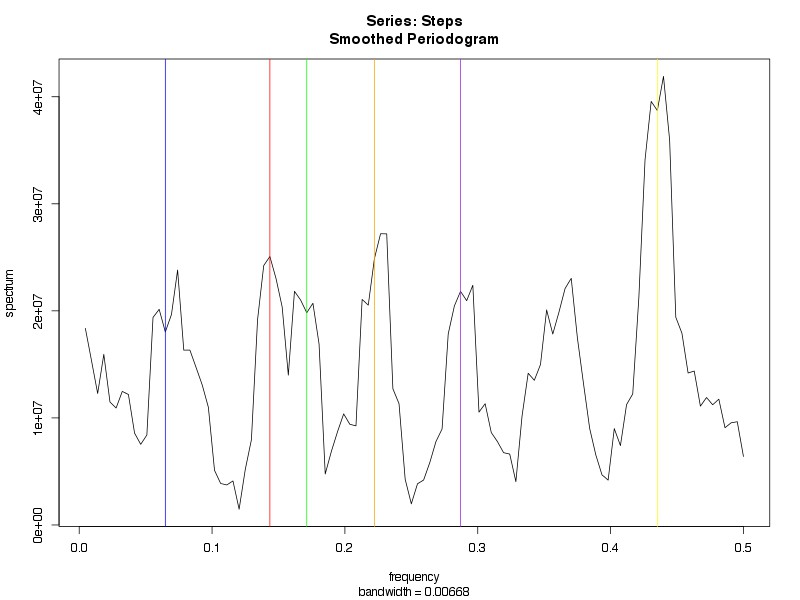
We had previously mentioned the periodogram as a key feature of the frequency domain approach to analysis. To review the interpretation, each value on the x-axis corresponds to a given frequency, and the amplitude at that frequency is the relative contribution to the behavior of the data. To provide some sense of these results, the peaks correspond to the following frequencies and periods based on the formula (Frequency = 1/Period):
Blue line: Freq = 0.065, Period = 15.4 days
Red line: Freq = 0.144, Period = 6.9 days
Green line: Freq = 0.171, Period = 5.8 days
Orange line: Freq = 0.222, Period = 4.5 days
Purple line: Freq = 0.287, Period = 3.5 days
Yellow line: Freq = 0.435, Period = 2.3 days
There is an exact mathematical relationship between the variance explained by a covariate in a regression or ANOVA model, and the amplitude of the periodogram at a given frequency, and one can even construct something similar to an ANOVA table based on the scaled periodogram (See Stoffer and Shumway for details). In fact, using the periodogram, one can also determine the autocorrelation functions and cross correlation functions (for more than one variable). These concepts are beyond the goals of this post, but we may return to them down the road as we build towards more complex analyses.
Filtering
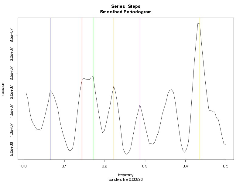
The periodogram in Figure 3 is unfiltered. One approach to attempt to clean up some of the noise, and perhaps shrink down the extra peaks, would be to apply a filter. As mentioned above, there are a number of methods for filtering. Within the time domain, creation of a regression model (Figures 1 and 2) is actually a method of applying a linear filter to data. Within the frequency domain, we can use a kernel function, which is basically like a window function for a moving average filter. Moving average filters have the important characteristic of bandwidth, which determines how wide the window of filtering will be (in general, the wider the bandwidth, the smoother the result). Figure 4A (leftmost) applies one such filter called a Daniell kernel, with m = 2 (for details, see ref), which doesn't do much other than broaden the peaks. In Figure 4B (middle), using a convoluted Daniell kernel (2,2) with a taper of 0.2, we see even broader peaks, and, although the some of the prior peaks do still line up, it does not appear to help us to discriminate among these several possible cyclical periods. Of course, perhaps if we played around a bit more with the filters--perhaps trying some different kernels or different bandwidths--we might be able to smooth down to maybe 1-2 peaks that dominate the cyclical effects of our data. For example, using a convoluted Daniell kernel with m = (7,7), we identify two primary peaks at frequencies 0.171 and 0.435 (corresponding to 5.8 day and 2.3 day cycles, Figure 4C, rightmost).
Figure 4. A (left) is filtered with Daniell kernel (m = 2). B (middle) is filtered with convoluted Daniell kernel (m = (2,2)) and taper = 0.2. C (right) is filtered with convoluted Daniell kernel (m = (7,7)). See text for details.
What happens if we use these frequencies in our regression model above? In Figure 5, we see each fitted line superimposed on the total number of steps. From a purely model-building standpoint, the results are not surprising. Including more covariates--some, but not all of which are significant--improved the ability of the model to fit the data, but at what expense? Are we simply fitting noise?
Figure 5. Steps with additional periods included as determined by spectral analysis. See text for details.
Of course, there are methods for determination of the confidence of these assessments. Without going into too much detail (see Stoffer and Shumway for details), we can evaluate the 95% confidence interval as a chi-square distribution of the spectrum, and derive intervals based on the bottom 2.5% and top 97.5%. The code details are in the R code for this post, but you don't need a p value calculator to determine that our confidence intervals very much overlap the rest of the spectrum (Figure 6), and thus imply that these 'peaks' do not reach any level of statistical significance (whether this is the best method to assess statistical significance, and importantly, whether we would be appropriately powered to detect a difference, are other questions). Either way, it appears that while there may be some signal of a cyclical pattern to the data, using these frequency domain approaches, we cannot state that any was more likely than noise.
Figure 6. Confidence intervals around the top two peaks obtained using convoluted Daniell kernel (m = (7,7)). Y-axis is log-scale. Lower peak is at frequency = 0.171 (red), and confidence interval is dashed red lines. Upper peak is at frequency = 0.435 (blue), and confidence intervals are in dashed blue.
So where does this leave us? On the one hand, we've conducted a fairly unbiased analysis of the seasonal/cyclical patterns in our data, and it does appear as though we have identified at least a couple of possible seasonal patterns. On the other hand, these patterns do not appear to match anything that would be feasible from a lifestyle standpoint. Perhaps the weekly (6.9 day) cycle is the most likely to be relevant (see prior posts), although from an unbiased standpoint, it is the 6th most likely cycle identified, and generally washes out with use of most filtering. Otherwise, it's likely that much of what we've done has been fitting noise, which is not very useful, and has potential to lead us down some wild goose chases.
At the start of this post, I mentioned that identification of a good analytical method is only the tip of the iceberg. We must also hone in on the question being asked, and the goals of the analysis. Spectral analysis, and frequency domain methods, are very powerful for data visualization and exploration. We will come across them often in the coming posts, particularly when we start to analyze the relationships between two or more time series. However, before we go there, we will next turn back to the time domain to finish up some discussion of methods of analysis of seasonal patterns in our data.


